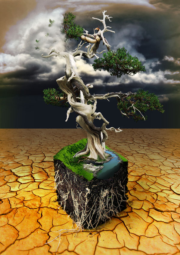
In today's tutorial we will show how to make a Slice of Nature Photo Manipulation. Make this tutorial we will use fancy filters and another simple technique so let's have a look.......
Our video editor Gavin Steele has created this video tutorial to compliment this text + image tutorial.
Before Getting StartedWriter’s always say that ideas are a dime a dozen — it’s the execution that counts. The same holds true with designs, especially illustrations. But the idea is important, without it nothing else happens.
The idea I had for this was pretty a simple. A twisted tree looming over a small slice of land, probably grass covered, maybe with a little river flowing, all with roots sticking out of the slice. I also wanted a brooding sky, dark and stormy. I can’t really draw for a lick, but I had a pretty good picture in my head. So I headed off to find some stock.
I wanted a bonsai tree as they had the ancient and twisted look I was going after. I searched for a good shot for free from sxc.hu, but didn’t have any luck. Finally I settled on this one from iStockphoto.
Next I was on to the slice of ground. I wasn’t sure if I wanted just uprooted ground or maybe something that had been pulled out of a pot. I hunted high and low on sxc.hu until I found this.
Dark and brooding sky. Thanks to night-fate for this one!
Cracked desert landscape, river, and grassy hills.
While searching through sxc.hu I decided I wanted a waterfall to fall from the tree.
Step 1
To begin with we need to prep the files. This is the part that designers dread, or at least I do.
First off, I started with the tree as I knew it was going to be the most time consuming. Everyone has their own tricks and tools that they like to use when extracting an image.
For the tree I used a two part approach. For the base and limbs I used the Pen Tool zoomed in to 400% and as many points as I needed. You can see that I try to cut the fuzzy edge of the image to give it a clean look.
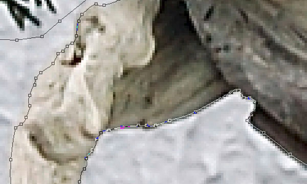
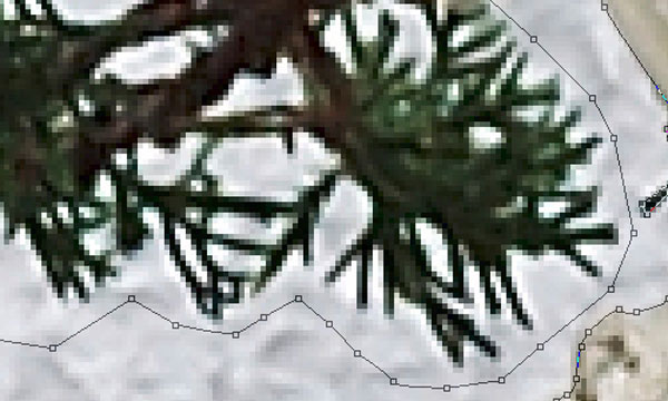
I left a wide birth around the foliage.
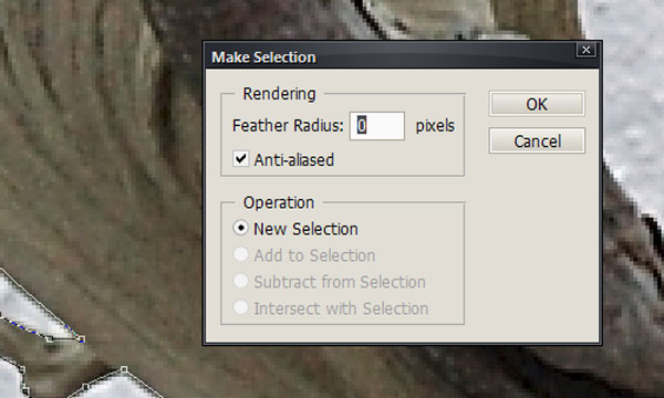
Once you are finished with your path you can use it to create a mask. With the Pen Tool right-click on the finished path and select make selection. Set the feather radius to 0 and make sure that Anti-aliased is checked.
Then with the selection active click on the add layer mask button.
Step 2
For cutting out the foliage, I took a different approach. Using the Pen Tool would have been too time consuming. First duplicate the “tree” layer. Next desaturate by clicking Image > Adjustments > Desaturate (Command +Shift + U).
Next we’ll to try to make the foliage as dark as we can. Do this by adjusting the levels. Go to Image > Adjustments > Levels (Command + L). Click on the set black point eye dropper and then click on the lightest part of the foliage. You can keep trying different points until you get the foliage almost black.
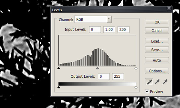
After the levels adjustment, use color range to select just the black foliage. Go to Select > Color Range. I like to set the selection preview to Grayscale for this, it can make it pretty easy to tell how your selection looks. Make sure Select is set to Sampled Colors, then use the Eyedropper Tool to select the black foliage. Adjust the fuzziness slider until only the foliage is selected.
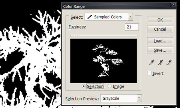
Once you have created your selection, simply delete the grayscale copy. Then invert your selection by going to Select > Inverse or Command + Shift + I. Select a decent sized (I used 60px) hard brush and click on your mask. Now use the brush to paint around the foliage, adjusting the size of your brush so you don’t mask out any of the tree itself.
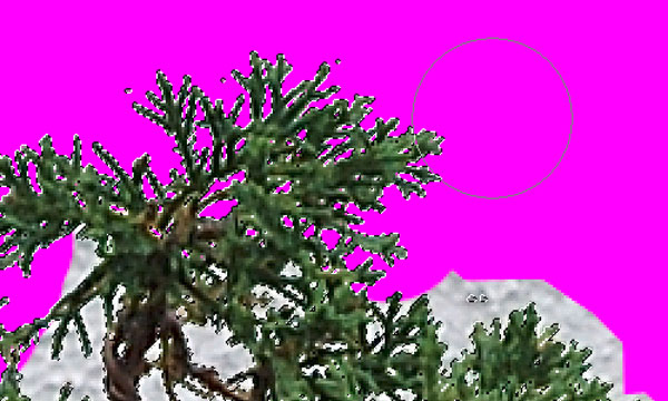
Once you’re done carefully painting in your mask, it’s time for some touch-up work. When you use a system like this the selection is never going to be perfect. The only real solution is to go through with a small brush and touch up any imperfections.
As you can see, I used a hot pink background layer below my tree so that it is easy to see where I have missed on the mask. I usually use a three layer system: 1 high contrast (usually hot pink because nothing in nature is usually hot pink), 1 white, and 1 black. This way I can turn on and off the various backgrounds to make sure that the final product looks good.
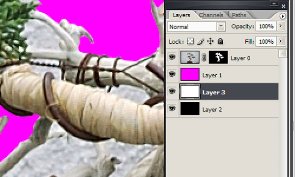
After the mask is completed, you can use the mask to select the object and drop it into your composition. Simply Command-click on the mask in the layers palette to make a selection. Then click on the main tree in the layers palette, and either Edit > Copy or Command + C to copy. Go to you main composition and Edit > Paste or Command + V to paste it.
This is really the only image that we need to do a serious cut job on. The rest will be taken care of as we move through the composition.
Step 3
Let’s work on the composition now. The first thing we want to do is create the background. I find that illustrations come together better with a background than on a blank canvas.
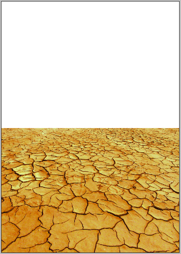
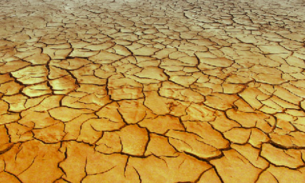
Start a new file with an A2 canvas (420mm x 594mm). Create a new layer folder named “Background.” Open the cracked earth photo, copy it, and paste it into the “Background” layer folder. Rename the layer “Soil.”
We are going to set the horizon line at about the center of the canvas. Hit Command + T to transform the “soil” layer. We need to resize the layer and give it some perspective so that it looks like actual ground.
Right-click anywhere on the canvas and choose Perspective. Pull the top anchors towards the center of the canvas, this will shrink the top of the image while leaving the bottom the same size giving the illusion of a horizon. Your goal here is to match the perspective to that of the slice of soil we are using for the base of the tree, as shown below.
Step 4
Now we will enhance the illusion of the ground running away from us. First we are going to add some lens distortion at the very bottom of the image. Duplicate the Ground layer by clicking Command + J or drag the layer in the layers palate down to the New Layer icon. Rename this layer “Ground Lens Blur,” then go to Filter > Blur > Gaussian Blur. Set the radius to something small around three as we don’t want the blur to be too pronounced.
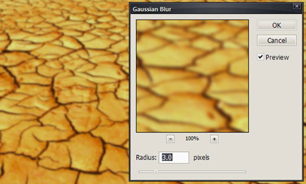
After applying the blur we need to mask out all of the area that we don’t want to have the blur. Make sure that you have the “Ground Lens Blur” layer selected and then click on the layer mask button at the bottom of the layers palette.
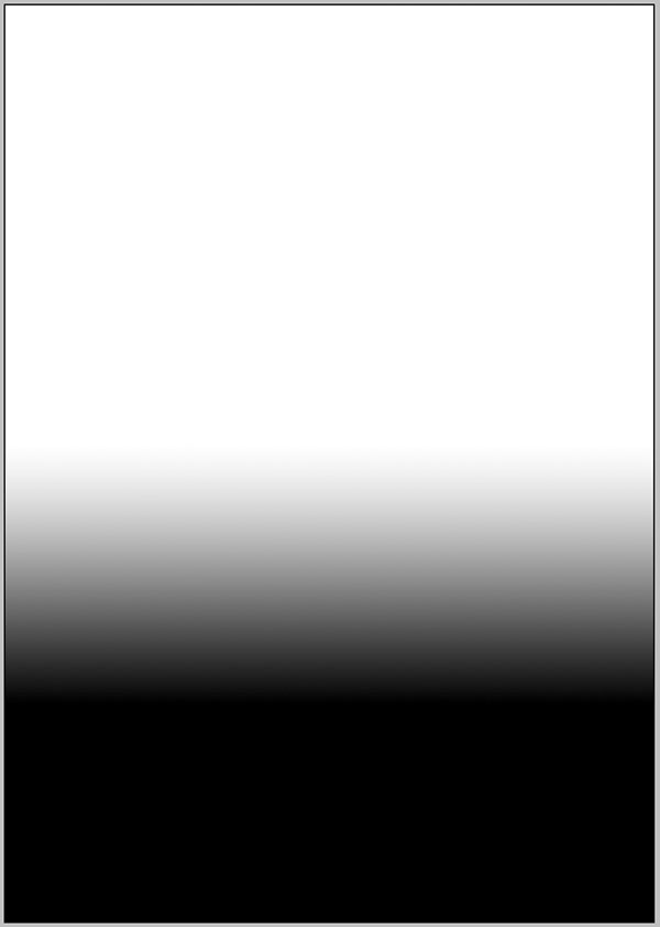
Press D to set the colors to default (black and white) and click on the Gradient Tool. Make sure you have the linear gradient selected. Click on the layer mask and draw a thin gradient going from white to black from the bottom of the layer to the top, your mask should look like the image below.

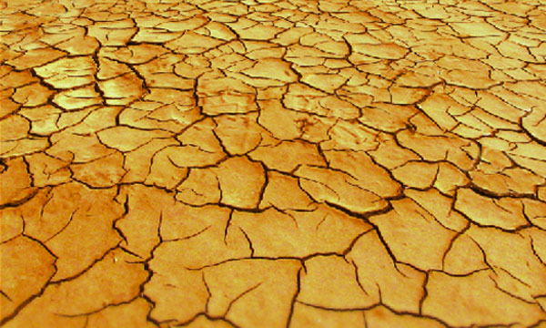
And the ground should now look like the following image.
Step 4
Now we are going to desaturate the ground as if it’s going away from the camera. Duplicate the original “Ground” layer again and name this one “Ground Desaturate.” Desaturate the layer by going to Image > Adjustments > Desaturate (Command + Shift + U).
Now create a mask for this layer like we did for the “Ground Lens Blur” layer. Use the Gradient Tool again to create a gradient in the opposite direction right along the horizon.
Set the “Ground Desaturate” layer to 72% Opacity. Your ground should now look like the following image.
Step 5
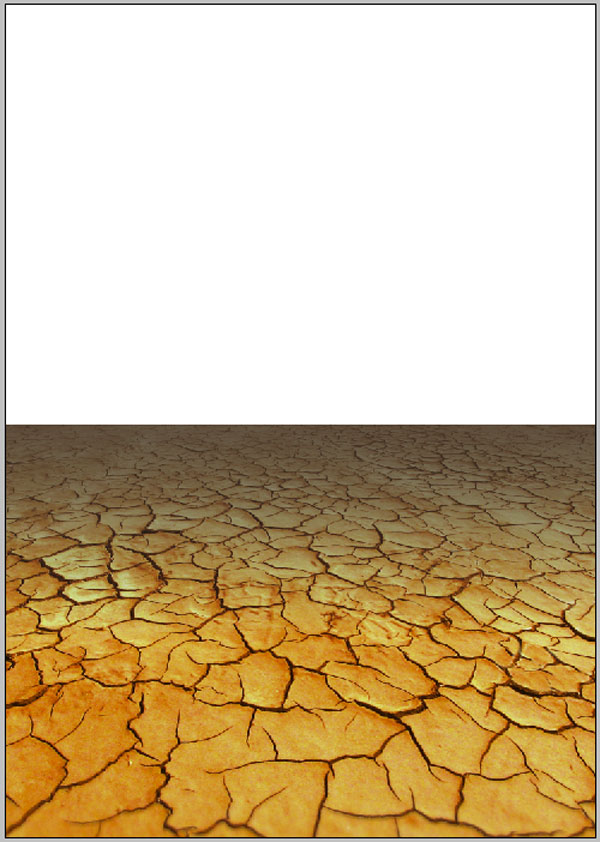
Now we are going to darken the ground at the horizon to match the dark sky. Create a new layer and name it “Ground Darken.” Command-click on the “Ground” layer. Use this selection to create a fill in the “Ground Darken Layer.”
Fill the selection with the color #463221, this is a dark color selected from the shadows of the cracks in the image. Alt-click on the mask of the “Ground Desaturate” layer. This will show you the actual mask.
Command-click on the Layer Mask on the “Ground Desaturate” layer, then select the “Ground Darken” layer and click on the Create Layer Mask button. This will create a mask identical to the mask on the “Ground Desaturate” layer. Your image should now look like that shown below.
Step 6
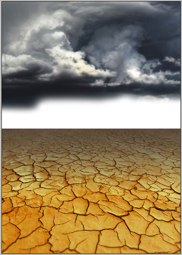
Now we will add the sky. Open up the sky image and copy and paste it into the “Background” layer group. Place it below all the ground layers. We want to resize it so that it fits the width of the image. Then flip it horizontally by using Command + T, then right-clicking on the image and choosing Flip horizontally. Then we are going to mask out the little dangling cloud on the bottom-right of the image.
Just create a mask for the layer, and paint out the cloud with a large, soft brush. Using the same brush, fade out the rest of the bottom of the image. It should look like the image below.
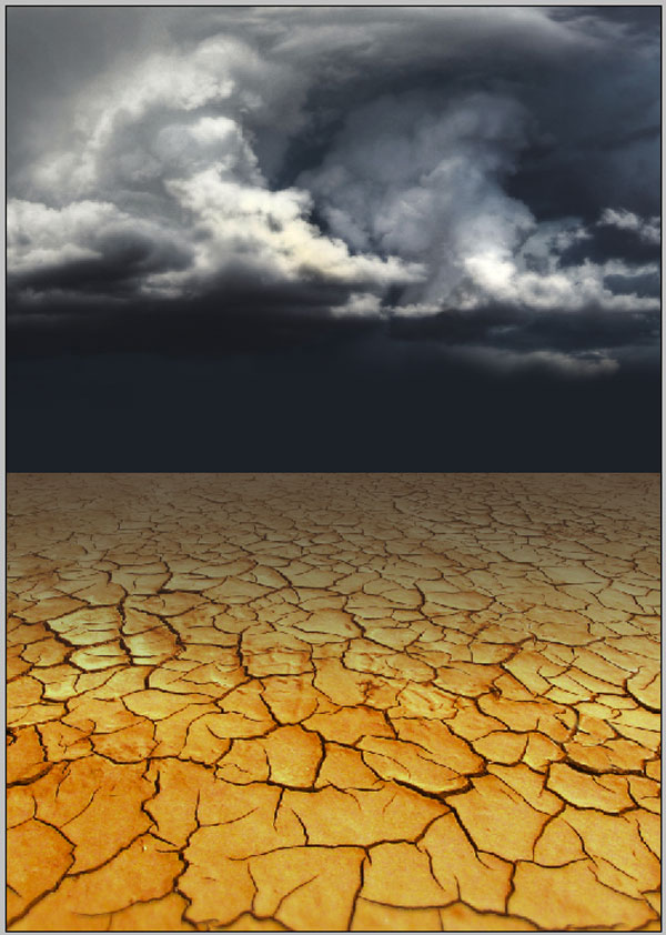
Create another layer below the clouds and name it “sky.” Fill it with the color #161a23, as shown.
Step 7
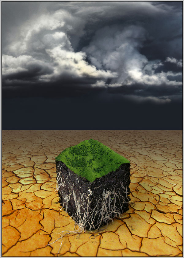
Now we are going to add in the slice of soil. Create a new Layer Group name it “Soil.” Open up the parsley pic and copy and paste it into the “Soil” layer group. Normally I would take this pic and cut it out, but for this I want to preserve the shadow from the original. To do this, I set the layer mode to Multiply.
Next, we are going to mask out the layers below it so that the white background will show through. Set the Layer Blend Mode on the “Dirt” layer to Multiply. Go ahead and erase the parsley stalks from the top with an eraser.
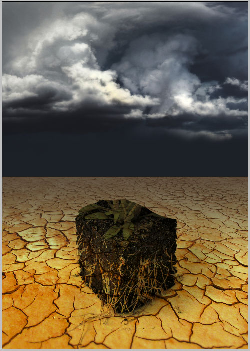
Now to mask out the background so the cracks don’t show through the dirt and roots. Click on the “Background” layer group and click the Create Mask button.
Use a hard brush to paint black on the mask to mask out the background. You want to pay the most attention to the front sides and the roots. For the roots zoom in tight (400%), and make sure you stay inside the lines. If you make a mistake hit X to switch to white and just paint the background back in.
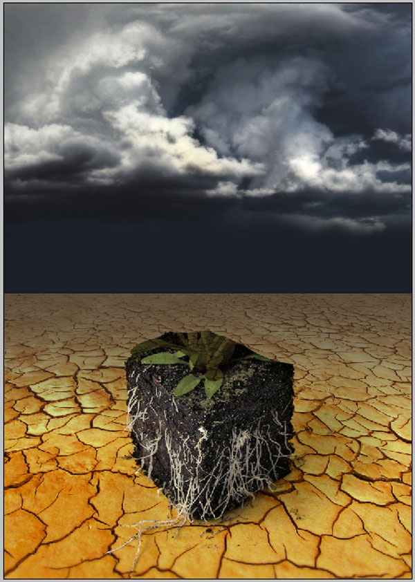
Step 8
Now we will add in the grass. Create a new Layer Group named “Grass.” Open up the green hills pic and copy and paste it into the “Grass” layer group. Rename it “Grass.” We want to shrink it down quite a bit so Command + T to transform it.
Shrink it down quite a bit, then right-click and choose Distort to change the perspective a bit. This takes a bit of playing around. What you want is to flatten out the hills a bit so that it looks more like rolling plains than just large hills. Experiment until you get something you like. I ended up with the image below (the crown of the hill will be masked out).
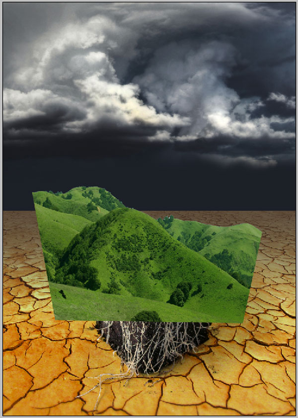
Now we need to mask out the unwanted parts of the grass. Create a mask on the “Grass” layer and paint out the unwanted areas with a hard brush. On the front sides try to follow the contours of the land as you mask. Play with it a bit until it looks natural, like a clean slice of the land.
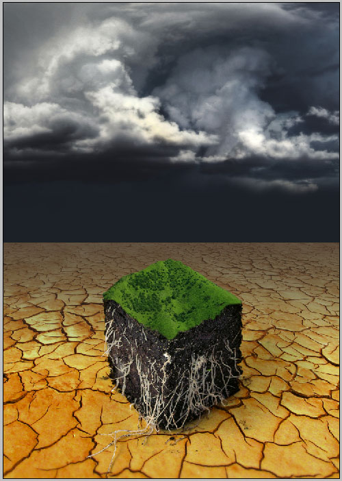
Now we are going to paint a light shadow on the top of the soil beneath the grass. Create a new layer named “Dirt Shadow” in the “Grass” layer group. Place it below the “Grass” layer, this will let you paint on it without worrying about going over the grass. With a medium sized soft brush paint black on both of the faces just below the grass. Set this layer to Multiply and a medium Opacity (I have it at 57%).
Step 9
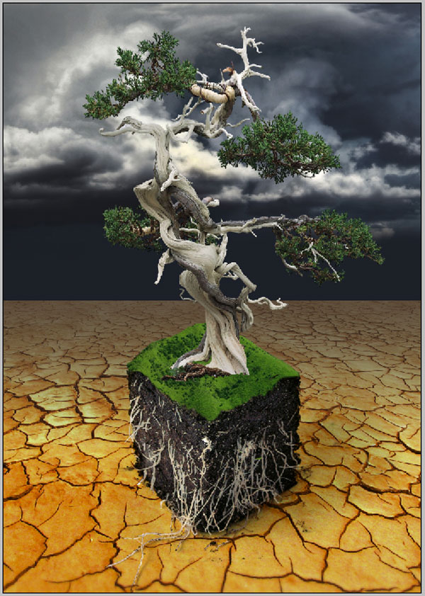
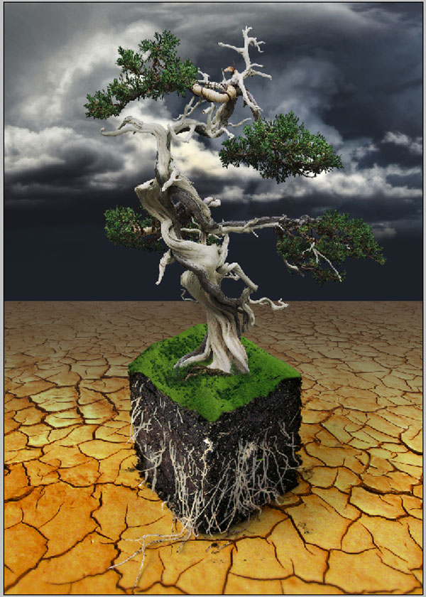
Now for the main focus of the illustration – the tree. This is where we are really going to focus a lot of our efforts, as this makes up the bulk of the illustration. Create a new layer group named “Tree.” Open your masked tree image. Command-click on the mask, copy and paste the tree into the “Tree” layer group. Rename this layer “Tree.”
If you notice any faint haloing around the image (small bands of light or dark) you can use defringe to clean it up. Go to Layer > Matting > Defringe and set the width. Experiment with a couple different widths to see which you like. I chose a width of 2.
Now we need to change the perspective of the tree. I wanted the tree to look like it was leaning forward a bit, not only to match the perspective of the piece, but also to accentuate the intertwined limbs at the top. Use transform to resize and then right-click to choose Perspective.
I always try to go smaller with the Perspective tool, than bigger because you can end up with some pretty pixely looking images by increasing the perspective too much. Grab one of the bottom handles and move it towards the center of the canvas, this will make the tree look like it is leaning forward. Find a look that you like.
Step 10
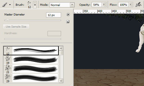
Now we need to mask out the bottom of the tree a bit so that it blends better with the grass below. Make sure that the “Tree” layer is active and click on the Create Layer Mask button. Load the Natural Brushes up and choose the very first brush (the 12px one), and set the Opacity to around 50%.
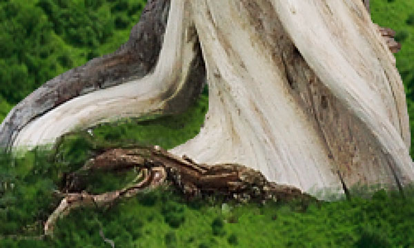
Now brush away at the bottom of the tree where it meets the grass. The idea is to create the illusion of grass growing up and around the base. You should only do a slight fringe as the tree is much larger in proportion to the grass.
Step 11
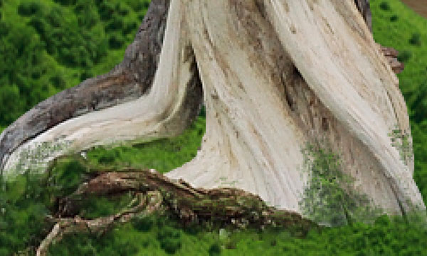
Now we are going to add a bit of moss growing up the tree. Create a new layer in the “Tree” layer group. Choose the Clone Tool and select the same brush that we just used for creating the mask at the base of the tree with the same Opacity.
Make sure that Align and Sample All Layers are checked. Alt-click to chose the grass as your source, then paint some moss onto the base of the tree. You want it to be thicker at the bottom and thin out towards the top. Also don’t paint with long strokes, instead just click repeatedly to build up the texture.
Step 12
Now we will add a curves adjustment layer to beef up the contrast a bit. Always use adjustment layers when you can. They will allow you to change the settings and look of layers, if you change your mind. Command-click on the “Tree” layer to make a selection.
By doing this the new adjustment layer will automatically have a mask so that it applies to only the selection. Go to Layer > New Adjustment Layer > Curves. We are going to lower the light level a bit and bump the contrast just a tad. To lower the light lever, grab the upper-right hand corner of the curve and pull it down.
To bump the contrast, you want to create a mild S-curve with an upward hump in the right third and a downward hump in the left third. This another spot to play with your settings until you get it exactly how you like.
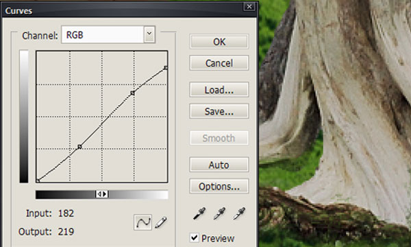
And your image should now look something like this.
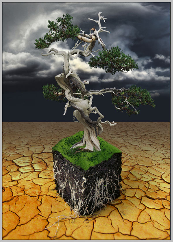
Step 13
Now we are going to bump up the highlights and shadows even more. Create another layer above the Curves Adjustment Layer. Alt-click on the New Layer button, this will bring up the new layer dialog box. Name the layer “highlights and shadows.” Set the blending mode to Overlay and check Fill With Overlay-neutral Color (50% Gray)
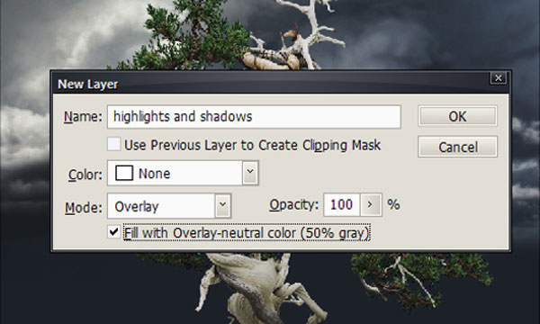
Now we are going to paint some highlights and shadows onto this layer. Choose a soft, round brush and set it to a low Opacity (around 10%). Press D to make sure your default colors are selected. You are going to use black to enhance the shadows and white to enhance the highlights. You can easily switch between the two colors by hitting X. This is where it pays to think artistically, you want to play up certain features of the image here. Again experimentation is the key.
Step 14
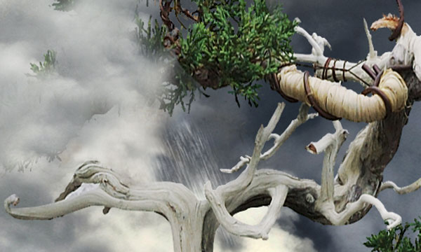
Now we are going to make it look like the clouds on the left are enveloping the top of the tree. Create a new layer (not inside any of the layer groups) and name it “Front Cloud.”
Select the Clone Tool and choose a soft, round brush set to about 50% Opacity again, and make sure that Sample All Layers is still checked. Look at your image and decide where you want the cloud to come out in front of the tree. Now click on the eye icon next to the “Tree” layer to hide it. This allows you to clone the clouds without worrying about picking up any of the tree.
When doing something like adding clouds, the secret is to constantly resample so that you don’t have artifacts that repeat over and over. Again an artistic eye is important here. You want your clouds to look like real clouds. Keep clicking your tree layers on and off so you can see how the cloud looks in relation to the tree. Once you’re done, you should have something like the image below.
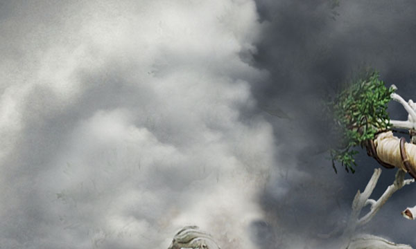
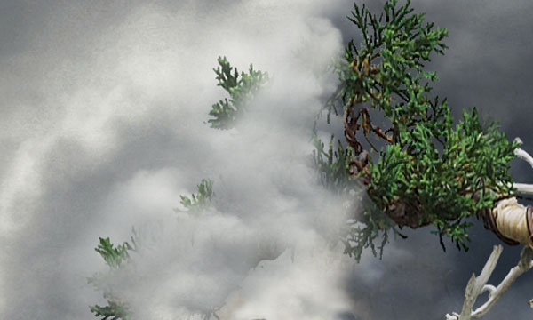
As you can see, I painted in some of the darker background cloud also. Now we want to mask out some of the clouds we created so the tree shines through. Create a mask on the “cloud” layer.
Use a soft, 100% opaque brush to paint the tree back in over the darker part of the clouds. Do the same with a few of the tips of the foliage. Then turn the Opacity down to around 10% and paint over some spots in the clouds a bit to make them look thinner. Eventually you should have something like the image below.
Step 15
Now to add some rain off the cloud. There are as many techniques for creating rain as there are photoshop users. This is one way to do it that is pretty quick. Create a new layer and name it “Rain.”
Create a square selection (the selection doesn’t need to be huge, as we only need a bit of rain) on the layer and fill it with 50% gray (#808080). Go to Filter > Noise > Add Noise. Set the amount to 12 and make sure Monochromatic is checked and Gaussian is chosen.
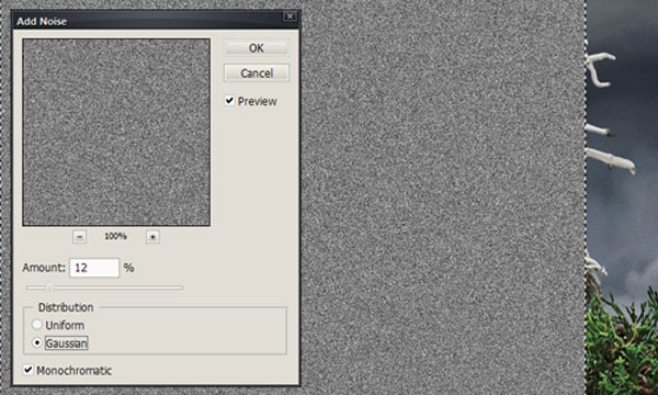
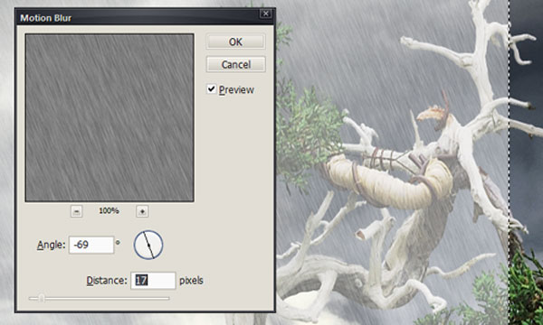
Set the layer mode to Screen. Now go to Filters > Blur > Motion Blur. Set your distance to 17 and your angle to -69. This will give your rain a slight left to right path.
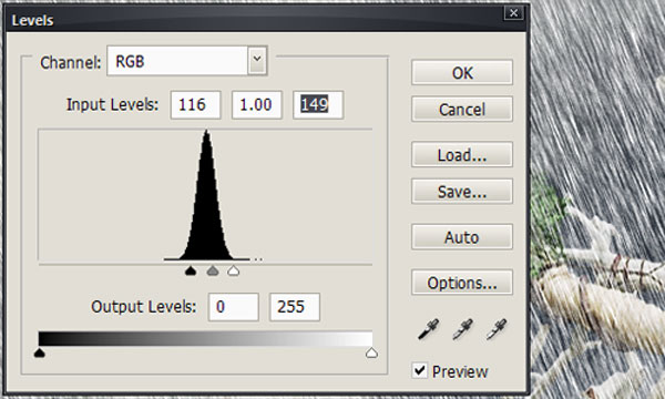
Go to Image > Adjustments > Levels. Here you want to push both the white and black sliders so that they are right at the edge of the curve. This will make the rain more pronounced.
Now we just need to mask out the area we don’t need. I also turned down the opacity some (72%) to make it look a bit more realistic.
Step 16
Next we are going to add the river that flows out and around the tree. Open up the river image and copy and paste it into the main image. Hit Command + T to transform it, right-click and choose Flip Horizontal. We want the river to look like it is coming around the right side of the tree. Fool with the perspective a bit to so that it looks like it is laying flat along the land.
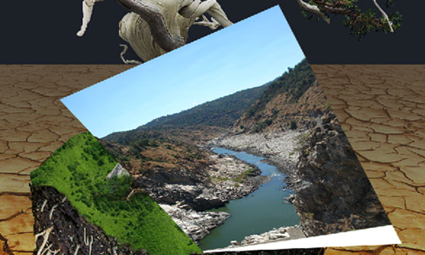
Now create a mask on the “River” layer and use a soft edged brush to mask out the sides of the river. Try to leave a bit of the rocky shoreline intact so that it still looks like a river. The soft brush will help the river rock blend over into the grass.
Then we are going to mask out the front of the river so that it looks like it ends with the end of the land. Use an 80% hard brush to do this, so you get a pretty clean edge. Try to cut it relatively straight along where the edge of the grass is. Don’t worry if your grass shows a bit as we’ll be covering it up later.
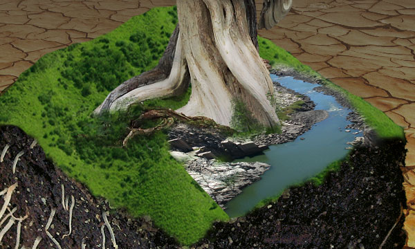
Next we need to fix up the front-left shoreline a bit and extend the water there as well. We will use pretty much the same technique as we did with the clouds.
Create a new layer called “Shoreline.” Pick the Clone Tool and a soft 50% brush. Now clone the rocky shoreline along the front-left, down to the edge of the soil. Clone in the water also.
Next we need to soften up the outermost edge of the rocky outcropping. Work along it with the clone brush until it blends naturally into the grass. I also cloned in some of the scrubby bushes from farther up the shoreline.
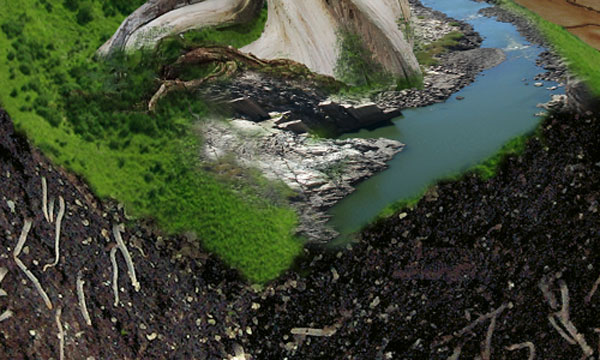
Step 17
Next we need to create the cutaway of the water. Create a new layer called “Underwater.” Using the Lasso Tool or Pen Tool to create a selection for the cutaway of the water. Fill it with the color #43605e (selected from the water).
Create a mask for the layer. Get the 12px natural brush that we used for masking out the bottom of the tree and use it to mask out the edges of the underwater a bit so that you are creating an underwater shoreline.
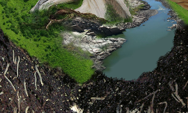
Now we need to darken it up a bit so it looks like underwater. Create another layer called “Underwater Shadow.” Set it to Overlay and about 75% Opacity. Command-click on the “Underwater” layer so that the water is selected. Then paint over it with a soft 25% Opacity brush set to Black. You want the water to get darker as you move down and away.
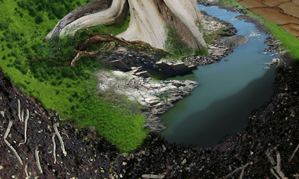
Step 18
Now for the last part of the illustration – the waterfall. Create a new layer group named “Waterfall.” Open up the waterfall pic. Using the Lasso or Pen, make a selection around the waterfall. This selection doesn’t have to be to accurate, just close enough to get most of the background out.
Copy the selection and paste it into the “Waterfall” layer group and rename it “Waterfall 1.” We are going to put the waterfall right at the crook of the tree where the rain is falling. Set the blending mode to Lighten and lower the opacity just a bit (82%).
Set the top of the fall where you want it. Now with a mask and soft brush, mask out the unwanted parts so that it appears to be behind the tree. Repeat the same procedure in the middle of the tree and down at the base flowing into the river, adjusting the size and opacity as needed.
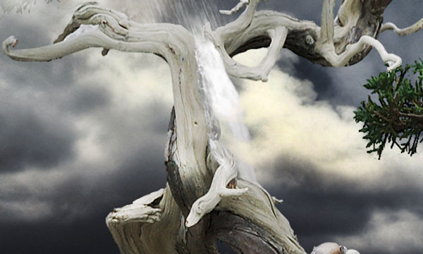
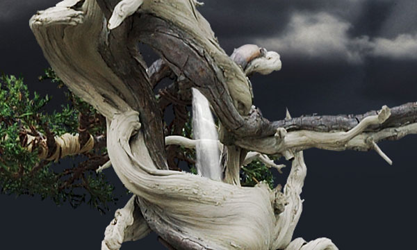
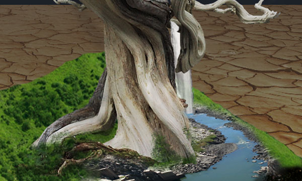
Now we’ll add some little splashes at the bottom waterfall. Create a new layer named “Splashes.” Set the mode to lighten. Use the Clone Tool (with the same 12px Natural Brush) to clone some bits of the waterfall to create some water splashing off the fall and some white water from the falls hitting the river. This effect should be pretty subtle.
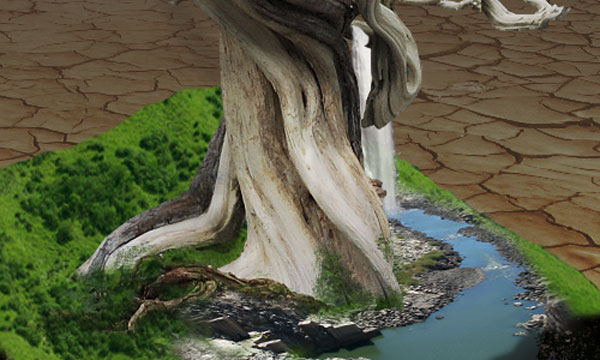
Image Tweaks and Adjustments
Now its time for adjustment layers to give the image a little extra oomph and then we should be done. First here is the full-size image without any adjustments.
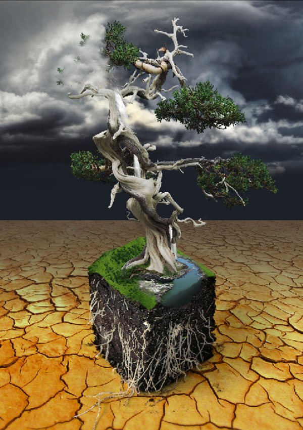
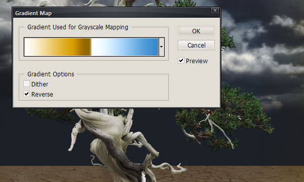
Add a gradient adjustment to “layer 1.” Set the Color to 39% Opacity. This is the Chrome gradient. Mask out the entire layer then brush in the edges with a soft brush. This adds some interesting colors around the edge that set off the piece.
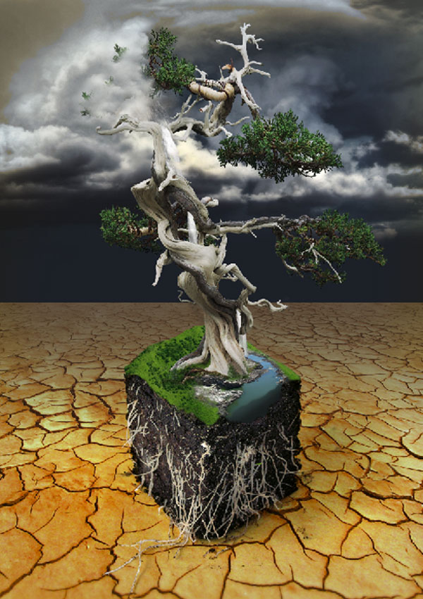
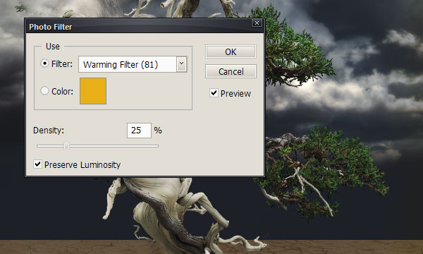
Add a Warming (81) Photo Filter set to Normal 45%, which obviously warms the piece a bit.
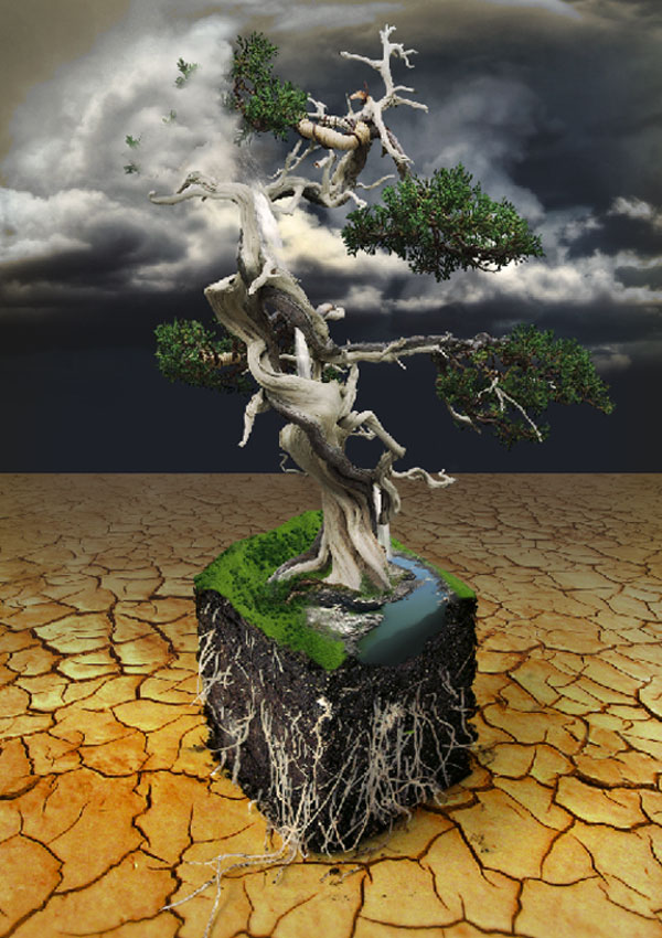
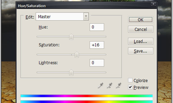
Add a Hue/Saturation Normal 100%, which punches up the colors a bit, especially the ground in the foreground – makes it pop.
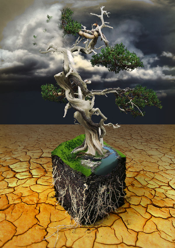
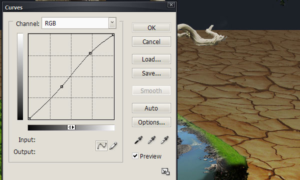
Add Curves Normal 100% – to up the contrast.
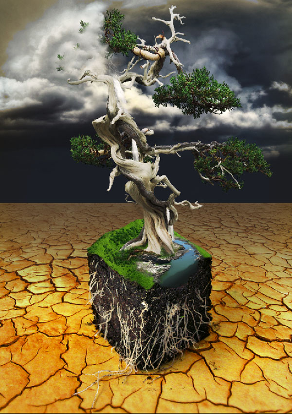
Add a Gradient Map (Medium Spectrum) with Soft Light 100%. Completely mask and brush back in at the edges. Again this adds a little color and highlights around the edges.
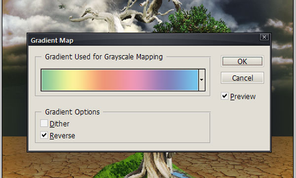
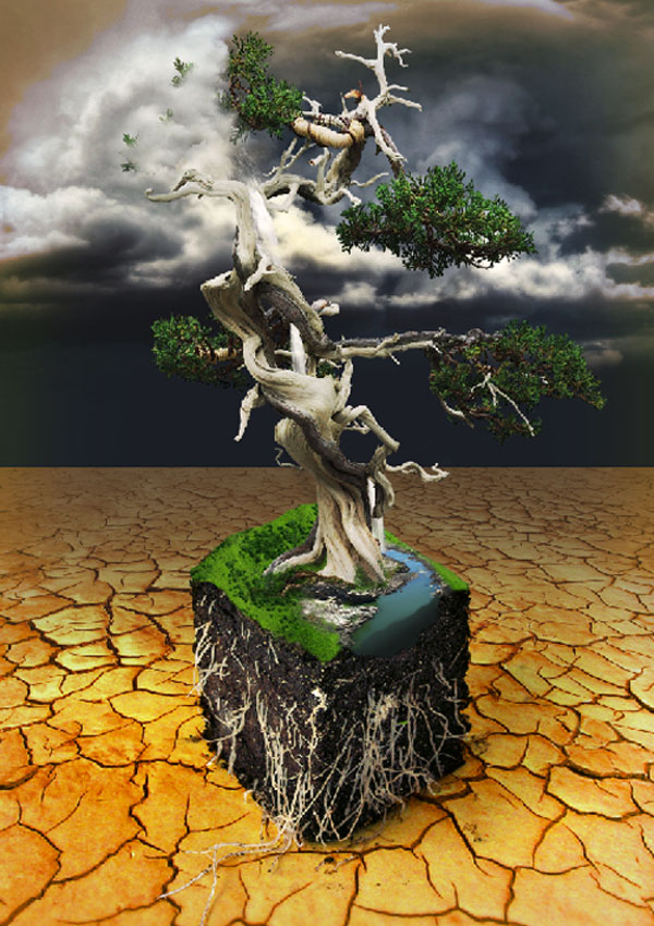
I like using off-color gradient maps and then just making them barely visible around the edges. I think it can help push the focus of the image a bit. I think bumping the colors a bit and upping the contrast helps too. But steps like this are all about preference and look and what feels right.
From here you could add a texture to the image or up the surrealism with some insects crawling around on the tree. You could even add a boat to the river or maybe some small animals to the grass.
Conclusion
I hope you enjoyed the tutorial, as much as I did creating the image. Remember this wasn’t just to show you how to do this image, but how to think and work to create your own images. Have fun creating!
Hope you can learn something new from this tutorial.
I feel really glad if you give me feedback through comment below. Soon i am going to show more interesting & innovative tutorials so please keep visit our blog. That’s for now.
Have fun!
Feel free to contact with Clipping Design for clipping path service, image editing service, image masking service or any kind of design support.
Thank you…
Credit: stylishwebdesigner
great work.. good job.. i really like it..
ReplyDeleteclipping path
satisfying details, prized and very good conceive, as share good stuff with good notions and notions, allotments of large details and figures and inspiration, both of which I need. Clipping Path Service
ReplyDeleteReally nice and comprehensive tutorial on nature photo manipulation. Really enjoyed the whole article. One more thing- would you please share a step-by-step guidelines on how to build and launch a clipping path services blog offering quality services to potential clients!!
ReplyDeletevery interesting blog post, good job and thanks for sharing such a good blog. Background Removal Services
ReplyDeleteThis comment has been removed by the author.
ReplyDeleteThis is an amazing post it's very useful and effective . Great thanks for this post, well-done . Cut Out Photo | Image Masking Service | Photo Cut Out
ReplyDeleteHelpful tutorial. IT helped me a lot. thanks
ReplyDeleteclipping path service
Raster To vector
This is very helpful post.Clipping path is the process of creating an outline around a center object while the rest of the image is being made transparent.I wrote a similar blog please visit
ReplyDeleteThanks a bunch for your post. Really enjoyed that!!
ReplyDeletePls Take a Look our Photo Editing service pages:
Image Work India
Clipping Path Service
Photo Retouching Service
Remove Background Service Provider
Color Correction Service
Ecommerce Photo Editing Service
Ghost Mannequin Service
Image Masking Service
Jewelry Retouching Service
Shadow Creation Service
This post really resonated with me. Thanks for the great content!
ReplyDeleteVisit Here: image manipulation services